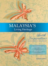
Once all the photographs and interviews were done, the next step was more of a consolidation.
I played & replayed the videos with the designers to capture the essence of their views - on Batik Malaysia and also on their dreams as designers.
eM.K. was working on the photos. That was good, or otherwise my hands would be tied. He selected most pictures he felt suitable. That means he had to go through a lot, selecting only the very best. I gave him the liberty to do so - as I believe he has the skills with his vast experience.
We then had outsource a graphic designer to assist in the layout of the book. We had the first meeting with her to sort our ideas and style. I mention we want something neat and catchy, and classy.
In other words, it was to be plain, but with style.
We tried a few background colours for the pages - from brown, grey and finally ended with black. The photos stood out best with black - where the eyes see the photos rather than the panel. We soon found out that this was what most art book does anyway.
The designer's work was relatively easy as there were no touch ups on the photos, as we wanted to remain its authenticity and to show the readers what went through the photographers' eyes. A photo took the space of a spread of 2 pages. 
This proved to be a right choice as later on people like the big view. However, that meant we had a small black panel for every spread of 2 pages - but that is ok. As I said, black did wonders.


Most of the segments in the book was written by me, except for a segment Fun With Pics. Again, you can see the headline is light - making this a light book for a heavy subject.
eM.K. suggested this segment - as he thought it would be a good insight to behind the scenes and more info on the designs and also on his subjects on the photographs. Also a lil bit of info on what went on during the interviews with the designers. He wrote well giving very good insights. Many people love this segment a lot - even one of the designers mentioned it. Up to today, I'm thankful that he suggested this segment.
We also had contributions by Pak Adriano for his 3 pantuns (Malay poems) which once again gave the book a lil bit of style - making it very Peranakan & Malaysian.
Although it seemed simple, but this whole process took a full 1 month, with a lot of bouncing back and forth with the graphic designer. There were minor changes each time, even up to the font size. However, we were quite open to her ideas as well eg. on the font type and layouts for some of the segments.
Finally, with much work and lots of late nights (up to 4am and up again by 9am), we were done, and it was next ready for print!
Read also: A Beautiful Journey - Part 3: Interviews


